


- April 16, 2013
What’s Your Favorite Mosel Wine Label?
- by Lars Carlberg
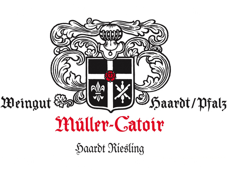 Müller-Catoir is in the Pfalz. I know. Yet I'm fond of their label and overall look. The colors match. The design is on ribbed paper, and the lettering is in Fraktur. It's an exquisite wine label with their coat of arms (including a fleur-de-lis), much like the neo-classical manor house itself—and, if you've visited there before, even the restroom impresses. The Catoirs just have a sense of style and an eye for details. Moreover, the winemaker, Martin Franzen, is a Moselaner. My vote for a Mosel wine label should count then, right?
Well, I'm obviously biased, but if I have to choose a producer from the Mosel region, then it's Hofgut Falkenstein.
What's your favorite Mosel wine label? Please leave a reply below. If you're not already a subscriber, just sign up to comment for free. You may choose, as I did, a label from another German wine region.
In general, I tend to like the classics, such as the late 19th-century label from Maximin Grünhaus. The von Schuberts have kept to this distinctive Jugendstil image for their Rieslings. The Superior and now the other dry Grünhäuser Rieslings have a replica of this first-edition label; the sweet ones (with Prädikats) have the label in lime green, which is better known and has been recently resized to the format of the first edition. In addition, the corresponding triangular neck label with the Prädikat listed is smaller than before. (Yes, I'm being rather geeky. Please bear with me.) Anyhow, like Rheingau's Langwerth von Simmern's colorful old-style label, you notice a bottle of Grünhaus on a table across a restaurant dining room.
Karthäuserhof—also in the Ruwer Valley—has a one-of-a-kind label, at least in my opinion. It's not really a label, but, instead, a neck strip. The pertinent information is on a back label, which more and more producers do to keep the front label clean. Like other historical labels, the hard-to-read font has now been changed. (For those who are curious, I describe in more detail the story of this peculiar label and others in my producer profiles.)
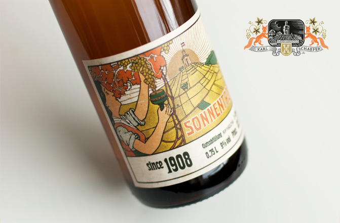
Back in the Pfalz's Mittelhaardt, I like Koehler-Ruprecht's labels, not to mention their old-fashioned wines. Karl Schaefer has a delightful, age-old label with foxes flanking the image of the vineyard site known as Fuchsmantel, or "fox coat," and has also relaunched an even older 1908 label for a light, dry and for a sweetish Riesling called Sonnentröpfchen, which have both sold well in Germany.
In a similar vein, the Middle Mosel estate of Max Ferd. Richter's Mülheimer Sonnenlay has had its Art Deco design with the zeppelin. A little downriver from Mülheim, Joh. Jos. Christoffel Erben has a remarkable label for sure. Also in Ürzig, Alfred Merkelbach's label is much-loved. Both have as their motif the village and Ürziger Würzgarten in the background. The Merkelbach label is less dramatic, more like a cartoon painting.
Another now-classic label is Willi Schaefer's. While many producers keep changing their wines and image, the Schaefer family stays true to their style and to their chubby Domprobst, or provost, who holds a glass of wine with one arm, while the other is draped over the wooden Fuder cask. This kitsch-turned-cult label dates from the 1960s. In addition, several producers still have a portrait of a prelate for their Erdener Prälat bottlings: Jos. Christoffel jr., Dr. Loosen, Mönchhof, Dr. F. Weins-Prüm, and Dr. Hermann.
In Bernkastel, the two Wwe. Dr. H. Thanisch estates—Erben Thanisch and Erben Müller-Burggraef—have continued on with their stylish Jugendstil labels from 1901. (Though both have recently fine-tuned their label designs.) Erben Thanisch even has matching white capsules with the VDP eagle and "Thanisch" in an old-time font. Willi Schaefer has the same look with the eagle and their name, as a logo, in black lettering on gold capsules.
Günther Steinmetz and Weiser-Künstler each have Jugendstil designs on ribbed paper. Frau Kropf of Weinhaus Porn, in Bernkastel, however, doesn't like Weiser-Künstler's label as much as I do. She loves the wines, but prefers the popular design of Van Volxem, which, she says, catches most of her customers' eyes first. Günther Steinmetz's traditional-looking label, which depicts the family's 19th-century slate house and barn, has a well-chosen Art Nouveau font and dragon emblem, and the layout is similar to the classic Mosel labels of Joh. Jos. Prüm, von Hövel (at least, the standard white label), and Zilliken. (Since the 2014 vintage, Steinmetz has tinkered with the new design and gone with a thicker, traverse ribbed-paper label.)
J.J. Prüm's label is well known and depicts the bridge, sundial (Sonnenuhr), and Prüm estate in Wehlen. The label's mat golden edge matches the ones on their capsule, which includes their name and the sundial. I also like the time-honoured label of the legendary Egon Müller with the vineyard name Scharzhofberger in cursive. This was once a typical style for Mosel labels. Egon Müller's capsules have also a mat golden trim with the initials "E.M." on the sides. Too bad, Max von Kunow of von Hövel decided to replace their coat of arms with the VDP logo on the capsules. Max preferred a cleaner look.
The best-known of the former Immich-Batterieberg labels has the playful Jugendstil picture of two cherubs shooting a Riesling-bottle cannon. Gernot Kollmann, however, chose to have the once ribbed-paper label modified in a more sleek design that highlights the vintage. Although the old Immich label is among my favorites, I have come to like the new one, which wraps around the bottle but not as far around as Van Volxem's. Clemens Busch also has a wrap-around label. I find it better looking than his previous one.
A.J. Adam has a classy antique label. Andreas Adam's friend and colleague Julian Haart does, too. Julian's is based on an old champagne label, whereas Andreas discovered an 1871 label with his mother's maiden name on it.
Bischöfliche Weingüter Trier has recently redone their labels with a stylish new design that harkens back to the turn of the 2oth century. In fact, the cellarmaster, Johannes Becker, found a lithographic stone for printing a label of 1902 Dhroner Hofberger Fuder No. 47. I like the new look of the Friedrich-Wilhelm-Gymnasium in Trier, including the label for Fritz Willi.
A few years ago, the Knebels chose a more modern design, as Matthias wanted the family name to be more recognizable on a wine rack with so many bottles to choose from. Daniel Vollenweider has a similarly contemporary design. Likewise, Florian Lauer of Peter Lauer updated the label of his family property, yet he kept his mother's handwriting. Helmut Plunien of VOLS has a streamlined design that may not be to everyone's taste, including yours truly. More important, I like what's in the bottle.
The Barths of Lubentiushof had their unique label only tweaked, whereas von Othegraven, in the Saar Valley, has an entirely new appearance under the ownership of the German TV host, Günther Jauch. Another large estate on the Saar, Dr. Siemens has a snail on their new-fashioned label, and the list goes on.
That's my rundown of some of the different producers' labels, among many others. What's your favorite? ♦
Image courtesy of Müller-Catoir.
- Posted in Articles, Mosel
- | Tagged: wine labels
There are so many great looking Mosel labels ! I think Immich-Batterieberg and Peter Lauer are my favorites.
Michael, those are two good choices, and not bad wines either.
I’m partial to the Willi Schaefer label, mostly for what lies beneath, but the kitsch isn’t bad either.
Steven, I like Willi Schaefer’s label, too. And, as you say, the quality of the wines is tops.
Lars, since you opened the Pfalz precedent, my vote goes to Rebholz. In the Mosel, Immich-B hands down.
Thanks, Daniel. Oekonomierat Rebholz’s label looks a little like Peter Lauer’s. Each has handwritten letters. The Immich-Batterieberg label is popular, both the old and new versions.
Lars, you beat me to the punch. I have loved the Max Ferd. Richter Mülheimer Sonnenlay Zeppelin label since I first saw it. Lovely design.
Noel, I figured someone would choose Max Ferd. Richter’s Sonnenlay Zeppelin as their favorite. I like the Art Deco design as well.
I like nearly all the labels you listed above, Lars, and especially enjoy how distinctive so many of them are. I’m quite partial to both the Merkelbach and Maximin Grünhaus labels. Any idea when the current Merkelbach label (or a close antecedent) first came into use?
I disagree with Frau Kropf and really like the labels of Weiser-Künstler. I also like the aqua-marine color of the label and loosely (if, perhaps, irrationally) find some association between it and the blue-slate driven, fresh and crisp style of the wines.
I like the general design of the J.J. Prüm labels but I really love when I come across older bottles with the abandoned type-face such as here. I know it’s terrible branding and wouldn’t recommend that any grower do it, but I always enjoy when the vineyard is listed in larger type than the name of the estate.
While I generally prefer older designs, I’m not opposed to modern labels and really like Clemens Busch’s among others. The only designs I don’t really care for are black labels, either with gold, silver or white type. They just don’t seem to be of a similar character with what’s in the bottle.
John, I knew that you liked Alfred Merkelbach and Maximin Grünhaus. I’d need to ask about the former.
Frau Kropf doesn’t like the aquamarine color. I’m a big fan of Weiser-Künstler’s Jugendstil label on ribbed paper. I also like the owls. Since the 2011 vintage, the owls are even on the capsules.
I agree about J.J. Prüm, too. I like it when the labels aren’t too stylized.
Clemens Busch’s label is much better now. As far as black labels, I feel the same.
I love this old Busch label, though. Was this ever actually circulated or was this just scrawled by hand for in-house storage?
I love that old Clemens Busch label, too. That’s my photo! By the way, the wine was delicious. Back then, I’m pretty sure that they didn’t sell their wines with handwritten labels. I should ask Clemens to be sure, but I’ve seen older labels that had only print. The labels from the late 1990s to a few years ago were less to my taste, though.
The Alfred Merkelbach label is from the 1950s.
Another vote here for the Immich-Batterieberg label as my favorite. I also like Grünhaus, Karthäuserhof, and Egon Müller on the more classic side; and Sybille Kuntz and Lauer for more contemporary labels.
One producer whom I wish would change their label is Jakoby-Mathy. Although I think that their wines are definitely underrated, I cannot get used to the “Jakoby Pur” labels, which strike me as rather tacky.
Outside of the Mosel, I really like the labels of Schloss Johannisberg, and the Königin Victoriaberg labels used by Hupfeld, and now Joachim Flick as well. Kühling-Gillot has one of the best of the more contemporary labels in my opinion.
Andrew, Immich-Batterieberg’s label seems to be a favorite of many Mosel wine lovers.
I agree about Jakoby-Mathy’s label.
Schloss Johannisberg has a great label. The Königen Victoriaberg is another good choice.
My choice would be Weingut Reichsrat von Buhl from Rheinpfalz. It’s such a pretentious label and sends signals to the past where German wine was so great (and still is), but when trade was high and prices good. I think it shows the power of riesling and associates to a time when banners were used by great families. I’m also a fan of Game of Thrones so that might just reveal why this is my favorite label!
Kjetil, I overlooked the Pfalz’s Reichsrat von Buhl label. It’s a prestigious property with a beautiful Jugendstil label designed by Franz von Stuck in 1887. Admittedly, I’ve never watched the Game of Thrones.
I really like the Müller-Catoir label too. It is one of the few that conveys a strong sense of tradition, but is also very clean and easy to read. I’ll second the standard Karl Schaefer labels as well –they look very cool and even though they have been used for many years (with minor changes), they are timeless and relevant today.
As for Mosel labels, I like Adam –clean and classic. Some of the famous Mosel labels are a little dated and come off as stodgy and old fashioned. I hate the Egon Müller label for example (and also Grünhaus and Willi Schaefer). It is completely understandable why an estate with a long history would choose to keep the old label intact –and it is actually quite admirable in my view. But it probably also does some harm to the image of these estates for many consumers who think of these wines as those that their Grandparents drank. Nostalgia for the 20th century is not strong for many Germans for obvious reasons which might help to explain the indifference to some of these wines. Maybe the domestic success of estates like Van Volxem (whose label I really like) can in part be explained by this idea (not to mention the style of the wines as well.)
The traditional labels certainly did their jobs very well back in the day. Before travel (and now the internet) brought consumers in contact with the great wine estates of Europe, a picture of a Palace on a vine-covered hill was the easiest way to explain where and from whom your wine came.
It is a bit of a paradox for me, because I prefer traditionally made wines and love German history and culture, but many of the labels just don’t appeal to me. Take Bassermann-Jordan for example. I love the older label (from 1811), but can’t stand the 1905 Jugendstil (Art Nouveau) label which just looks kitschy to me.
I also really like the bottle-neck label from Karthäuserhof for its minimalistic simplicity.
Like everything wine-related (or Art appreciation in general), it comes down to personal preference –and of course we don’t drink labels, but wine.
Cheers,
Bill
Thanks for your thoughts, Bill. I agree with you on the Müller-Catoir and standard Karl Schaefer labels. Speaking of top producers in the Mittelhaardt, I forgot to mention the pretty cool retro labels from von Winning. I’m less a fan of their tall and heavy bottles, though.
A.J. Adam has, without a doubt, one of the best labels on the Mosel. Although I understand your point about old-fashioned Mosel wine labels, I’m glad some producers have continued on with their traditional designs. Many of these date from the late 19th, early 20th centuries. Back then, Jugendstil was actually the “young style.” As I indicated in my article, Willi Schaefer’s dates from the 1960s.
In addition, I’m glad that certain producers, like Maximin Grünhaus, are staying true to their house style. It’d be a shame if all producers tried to look modern and to produce wines that appeal to the mainstream. Like Bassermann-Jordan, Maximin Grünhaus once had a pre-Jugendstil label.
Of course, it’s a question of personal taste, and what’s in the bottle is most important.
Bill –
Although I generally love the better Art Nouveau labels – I am partial to the style – the Basserman-Jordan one that you mentioned strikes me as rather forced in terms of its execution. It just doesn’t “flow” to me the way that the Grünhaus and the Batterieberg (original or current) labels do, nor does it draw me in. Thankfully, the product inside the bottle is much better.
There is a lot to like in Mosel Riesling labels and my vote would go to Adam, JJ Prüm, von Hövel and Weiser-Künstler. It seems that an increasing number of growers in today’s wine world is seeking professional support in guessing what will attract the occasional client in a shop. The targeted client base is of course global, rather young, rather wealthy and rather sophisticated. The safe route for connecting with these people on a global scale is via bottle and label design that follows the rule book of successful corporate design. We can find a lot of boring (but never ugly) results in wine shops and supermarkets these days, the common attribute being that the label is professionally put together, but lacking in character. Character together with certain quirks is swapped for better connectivity. Now what would you expect from the wine in the bottle? Mainstream is the route to success. All I can say as a consumer is that I find many of these new labels totally interchangeable and the often-used extra-heavy bottles simply pretentious and off-putting. I don’t fancy a rear spoiler on my car. With an office job in the financial industry as my background, one of the great pleasures of drinking wine is connecting with a tradition that is much older than I am, the modern world or the whole advertising industry. I think I expect a notion of this idea to be reflected in my wine label. This is a mere personal preference and I fully understand, that relying on century-old, dusty labeling may be a more attractive option for well-known estates than for relatively new members of the fine-wine producer community. But I’d choose an ugly label over a slick commercial one anytime, at least if I don’t know the producer.
What a great reply, Stefan. I couldn’t agree more.
It would be interesting to hear from those who have updated their labels recently in order to appeal to a younger audience if doing so helped selling their wines. I like references to the past and think that Fraktur has its place as does the Helvetica-inspired Immich-Batterieberg label. Although I am not a fan of the typeface that Weiser-Künstler chose I very much like their clean layout as it nicely groups the information in order of importance (vineyard – region – vintage – style and, finally, who made it). I wonder if Frau Kropf agrees.
Uwe, a number of producers came up with a new look or updated their labels after a change in ownership, such as Van Volxem, Dr. Siemens (formerly Bert Simon), von Othegraven, and Immich-Batterieberg (with a bang!). I know Van Volxem’s then new design has been a success. Moreover, Van Volxem and Immich-Batterieberg each have the wrap-around labels for putting a wine merchant’s name or the importer statement in the blank extra space. This allows for flexibility, as they can print the labels themselves, but one drawback is that they don’t have the same choice of qualtiy paper as a print shop does.
I should ask Knebel if their newer label has helped with sales, especially among younger wine drinkers. Over the years, a lot of family properties have changed or, in the case of Fritz Haag or Schloss Lieser, fine-tuned their labels.
In my article, I mention that more and more producers are using back labels in Germany to keep the front ones clean. Yet this requires an individual back label for each wine that is imported to the States. Usually, there is one standard back label for all the wines selected by the importer. Nevertheless, I really like A.J. Adam’s retro label. In the 19th century, the labels looked more Burgundian with just the name of the village/site, producer, and vintage. There was rarely a predicate, except Auslese, and Riesling was understood.
I’m fond of Weiser-Künstler’s logo.
Weil’s old labels from the 70s (I’ve had two bottles with such labels, a 71 and 76) are, for me, the pinnacle. First, the map – what wine geek isn’t a sucker for maps? And while I’ve seen some maps on German back-labels, the older Weil’s are the only ones to my knowledge that incorporate such a map on the front label, giving it serious front-label real estate. This tiny map covers key Rheingau villages from Rüdesheim all the way to Wiesbaden – Rauenthal, up in the hills, is even represented. The village relevant to Weil (Kiedrich) is in red. Second, I appreciate the fact the font sizes give prominence to 1) the region (Rheingau), 2) the village/vineyard (Kiedricher Wasseros) and finally, 3) the producer (Weil). Finally, I just like the detail and pre-marketing-slickster-era jumble of the label, the details, from the crest in the upper left, to the circular inset view of the Turmberg, to the vine and grapes etching, to the gold foil that is used fairly liberally. I can’t imagine a winery today being able to incorporate so much, to say nothing of a winery spending this much to producer such a label! This had to have cost a fortune – I’d like to frame it and put it on the wall.
Stephen, I remember you posting on Twitter/Instagram a back-label shot of an Egon Müller Auslese 1959 with a similar map and style. Was it the same US importer? If so, was it Frank Schoonmaker? Besides the village of Kiedrich and the site of Gräfenberg, I noticed that the vineyards Steinberg and Markobrunn are also highlighted in red, though they belong to the village of Erbach. Is there a reason for that? Does Robert Weil still have vines in Kiedericher Wasseros? Speicher-Schuth, which has a similar baby-blue-colored label as Robert Weil, owns vines in Wasseros along with Gräfenberg. On the 1976 Robert Weil label, the gold trim looks similar to other producers’ labels, such as J.J. Prüm.
Neither the 59 Egon Müller nor the Weil’s are Schoonmaker stock, alas. As for Steinberg and Markobrunn being highlighted, I wonder if it isn’t the first of many marketing attempts to show that, “I’m close to this place that is very famous for its quality, so my quality must also be great!” Something like that.
I also wanted to mention I appreciate the older Weil label so much because I find their newer ones sort of disgusting.
That makes sense, as Steinberg and Marcobrunn are famous. Yet the sites around Kiedrich are arguably the best in the Rheingau, along with Rüdesheim.
I wonder what’s with the baby blue in Kiedrich? Perhaps Speicher-Schuth copied Robert Weil. I don’t know.
“I also wanted to mention I appreciate the older Weil label so much because I find their newer ones sort of disgusting.”
Yup.
And yet the Yamazaki labels are so nice. Go figure.
Stephen –
My thoughts exactly. The old Weil “map” label is great, and I don’t understand why they ever changed to the current gold and baby blue mess.
I actually don’t find Robert Weil’s labels that bad. In fact, the baby-blue capsule and label look good on the traditional brown Rhine bottle. Most important, Robert Weil never bottled their Rieslings in that awful-looking, 350-mm, blue-green Rheingau flutes. What a poor marketing strategy that was by the Rheingauer Weinbauverband e.V.
My next poll will be on the different types of bottles for German Riesling.
By the way, I like the drawing of the Porta Nigra for Trier on the old Egon Müller back label: “The Moselle Wine Vineyards.”
About as unoriginal a response as can be imagined given how many votes they’ve already got, but I love the Immich-Batterieberg labels. Maximin Grünhaus and JJ Prum labes are also very attractive to me.
Labels that I’m not crazy about on wines that I love include Schaefer, Adam, Zilliken.
Admittedly, I was one of the early critics of Immich-Batterieberg’s new design. I was upset that Gernot decided to give the previous label a modern twist. Yet he proved to be smart in his decision. I was more conservative and liked the ribbed paper of the various older labels. (Please excuse my fetish for ribbed paper.) In Immich-Batterieberg’s Schatzkammer, some vintages have oversized labels that seem to cover the entire bottle but also look pretty cool.
Alex, I’m surprised you don’t like A.J. Adam’s label, though. Willi Schaefer’s look is kitsch, but likable.
Hot damn! Immich-Batterieberg’s label is well liked. I’m starting to wonder if my choice of Müller-Catoir was “Pfalz.”
I spoke yesterday with a German winegrower who was lamenting the use of mid-twentieth century labels, especially on Mosel wine bottles. My German isn’t very good, but I believe she called them “staubig,” or dusty, even though she says she likes both the wines and the people that make them. It was interesting to see a grower criticizing the labels that are widely praised in this thread (including Karthäuserhof and Willi Schaefer), and so many factors are at play here. First, as Bill mentions, 20th Century nostalgia isn’t popular in Germany, nor should it be. Then, there’s the issue of how the Mosel (and its wines) are seen by growers and the larger population throughout the rest of Germany, an unfortunate subject the likes of which hasn’t much been discussed here. This is probably for the best, as we don’t need a never-ending thread on which GGs German critics like to drink and how only foreigners drink Mosel wine, as that can be found elsewhere on the internet.
Then there’s the fact that I’m a relatively young wine geek in New York that finds old-fashioned labels charming, evocative and distinct. I don’t share the experience of having seen similar labels on German supermarket shelves for the past 40 years and don’t associate old kitschy labels with crappy plonk. I’m starting to think my appreciation of the older styles may be a bit naive, yet I still think it’s important that historic styles as well as historic labels are preserved.
Yes, staubig is correct. In Stefan’s previous comment, he uses the term “dusty” as well. I need to ask Bill what he exactly means by the 20th-century nostaglia isn’t popular among most Germans. The labels are often either from the early 20th century (Jugendstil) or from the 1950s onwards. In Germany, Mosel wine is considered passé, if not kitsch. Many Germans think of either sweet plonk at discounters or sweet wines from top producers.
For the 2012 vintage, both Reinhold Haart and Nik Weis have new stylish packaging. Reinhold Haart just has “Haart” on the front label. As there are a number of Haarts in Piesport, it’s less clear than before. For their dry-tasting Rieslings, St. Urbans-Hof has gone to a white label with “Nik Weis” in large font at the top.
It’s too bad that traditional German culture, such as the Fraktur typeface, is often associated with Nazism, even though the Nazis rejected this font as “Schwabacher Jewish letters,” preferring instead the Latin and more legible Antiqua font. Go figure.
Carl von Schubert of Maximin Grünhaus has now made another slight change to the look of his labels: namely a new blue-trimmed neck label has been added to the top dry wines.
In the 2013 vintage, get ready for new labels from Selbach-Oster and von Hövel, plus Karthäuserhof has a different look with a retro neck label on a taller 350-mm, antique-blue Schlegel bottle. See “Mosel Wine: Bottle Types.”
Grunhaus Superior, no contest.
Honorable mentions: Christoffel, Willi Schaefer, Batterieberg, Weins-Prum Erdener Pralat.
Best outside the traditional genre: Julian Haart.
Worst: Karthauserhof, Selbach-Oster.
Most annoying: Donnhoff (for its mysteriously disappearing ink at the slightest scuff or slightest amount of humidity), Keller Absterde (for the altogether too-cute misspelling).
Thanks for your top picks, Keith. Grünhaus has for all its dry Rieslings, including Superior, the same retro label now. I take it that you’re referring to Joh. Jos. Christoffel, not Jos. Christoffel jr.
Both Karthäuserhof and Selbach-Oster have changed their labels for the 2013 vintage.
I also don’t like the trend to smaller front labels with an accompanying back label. Grünhaus is an example of that.
Schloss Saarstein and Dr. Fischer – Bocksteinhof have new retro labels, designed by the ever-present Medienagenten. These look really good. I especially like the ribbed-paper labels of Dr. Fischer, which will eventually have the extra-tall 350-mm bottles in the future. I prefer the more modest-sized 330-mm bottles.